EMBRACES IN SPANISH
“I want to make inclusive bras” – said Carmel.
“You mean, all sizes and colors?” – I asked, naively.
“Sure. But for mastectomy survivors.” – she concluded.
The plot twist I did not expect.
Carmel made the thing she wished existed. And I was all for making her bra-nd succeed.
https://www.abraso.nl/
Branding
Illustrations
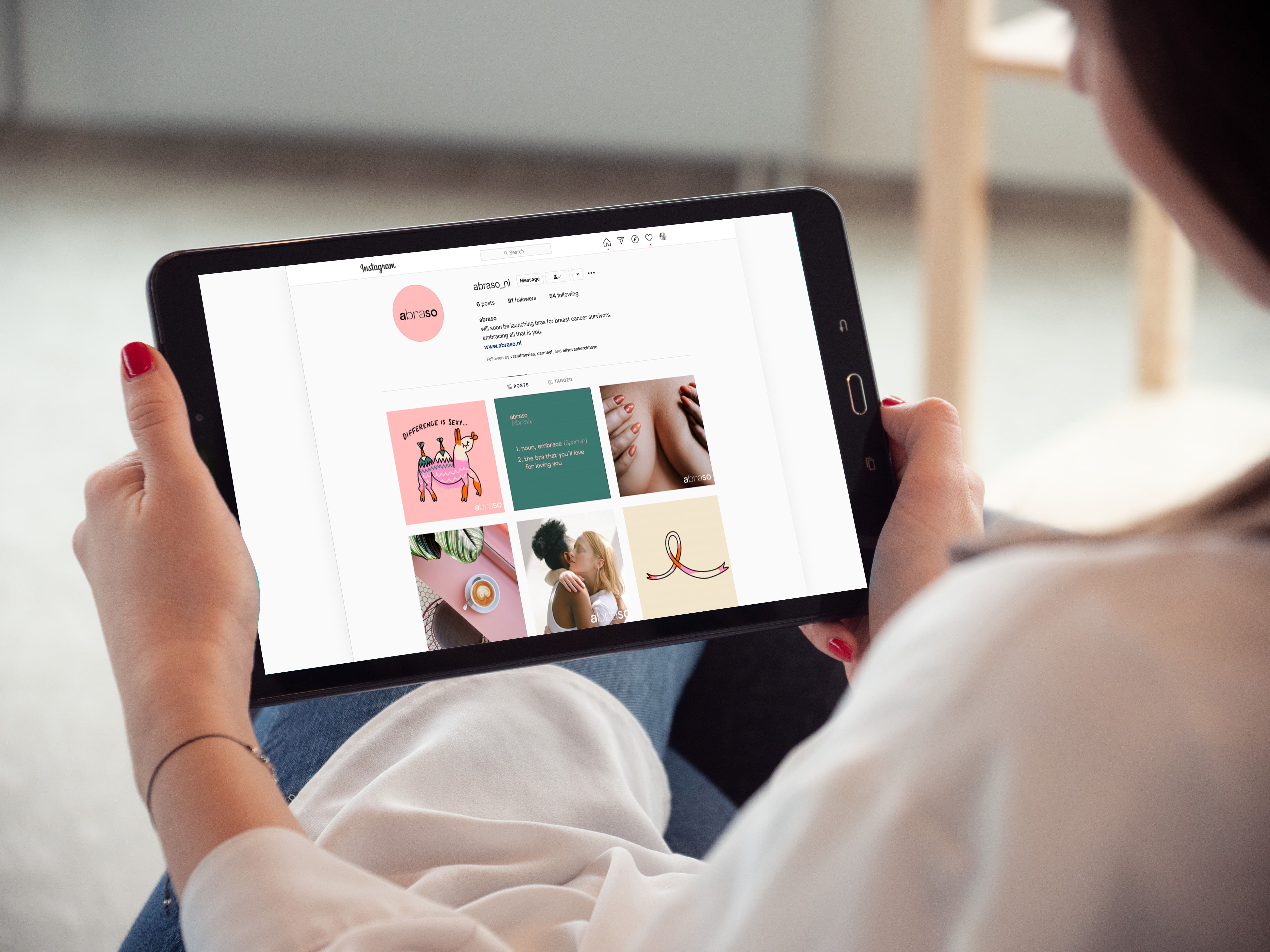
Social Media
Package
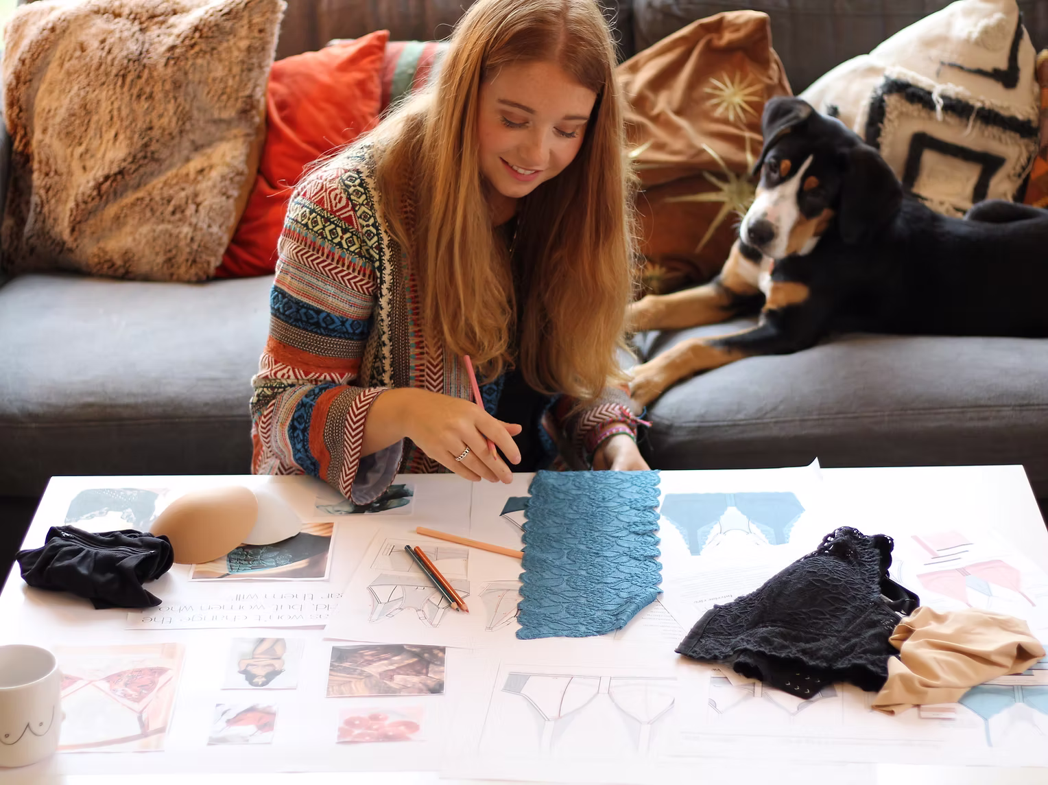
On our first interview Carmel told me about her challenge: Mastectomy bras suck. They are all bland and medical looking. What she designed was something different: beautiful, colourful, sexy, well-fitting, next to accommodating additional functions her users needed.
She needed a name, a full brand, package and social media kit.
the people
THE NAME
We set off with an interview. Carmel filled in the blanks of my market and demographic research with her knowledge and personal experience.
Surviving breast cancer is no small feat. After getting through the thick of it, all these superheroes – in my eyes that is- wanted to do is continue their life normally. In their case, it meant reclaiming their bodies and feeling confident again. Embracing all of themselves.
Competitors missed a huge gap. They kept talking to these ladies as if they were still in a hospital.
We had to flip the script – empower, cherish and elevate our customer’s stories and help them step away from being “medical subjects”.
Infuse every single aspect of the brand with empathy – make it hopeful, cheerful, and even cheeky.
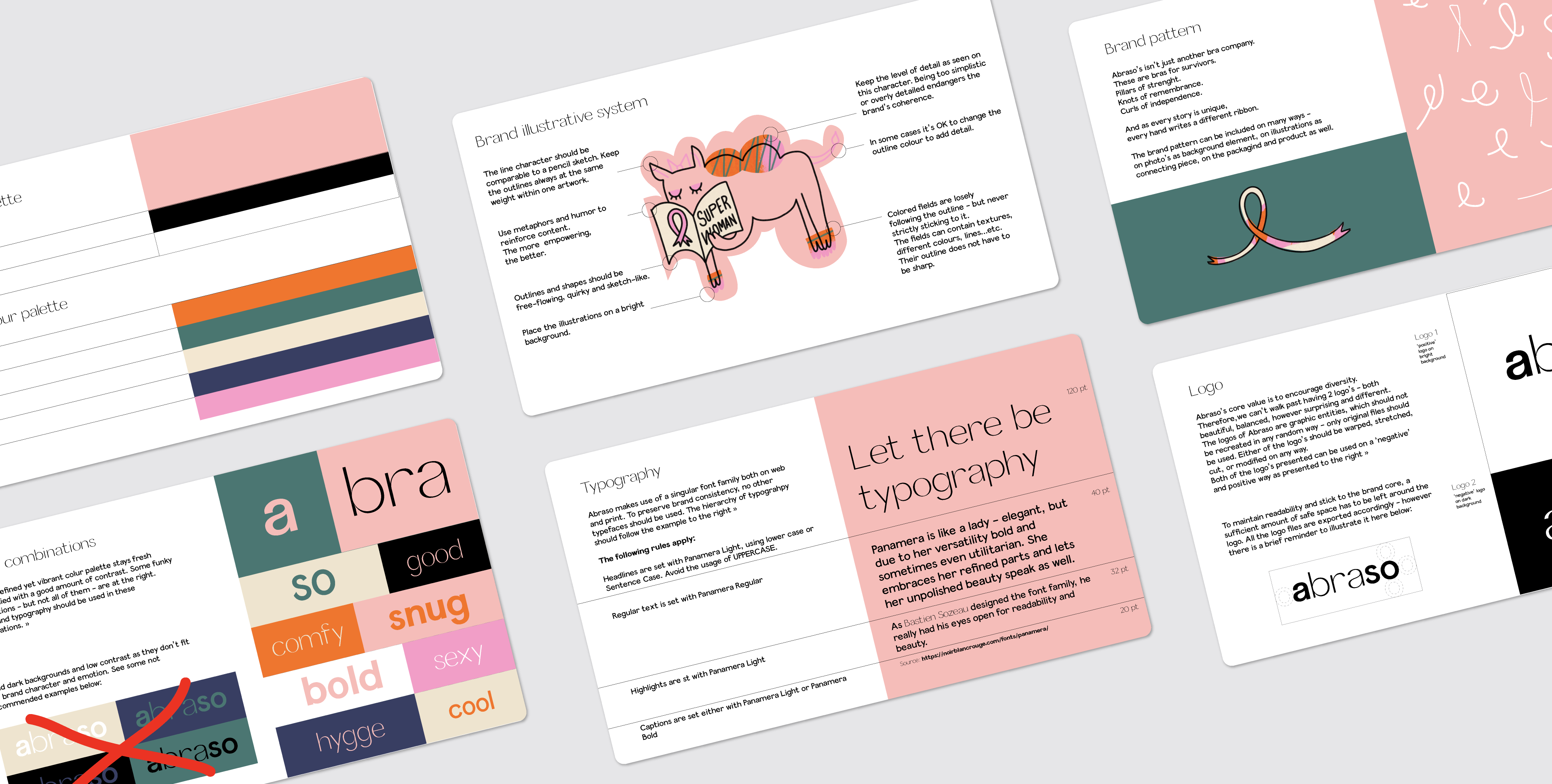
The brand cradles uniqueness, and all differences with a smile – appreciating variation. They make bras. A good bra holds you like a good hug. “Abraso” means hug in Spanish.
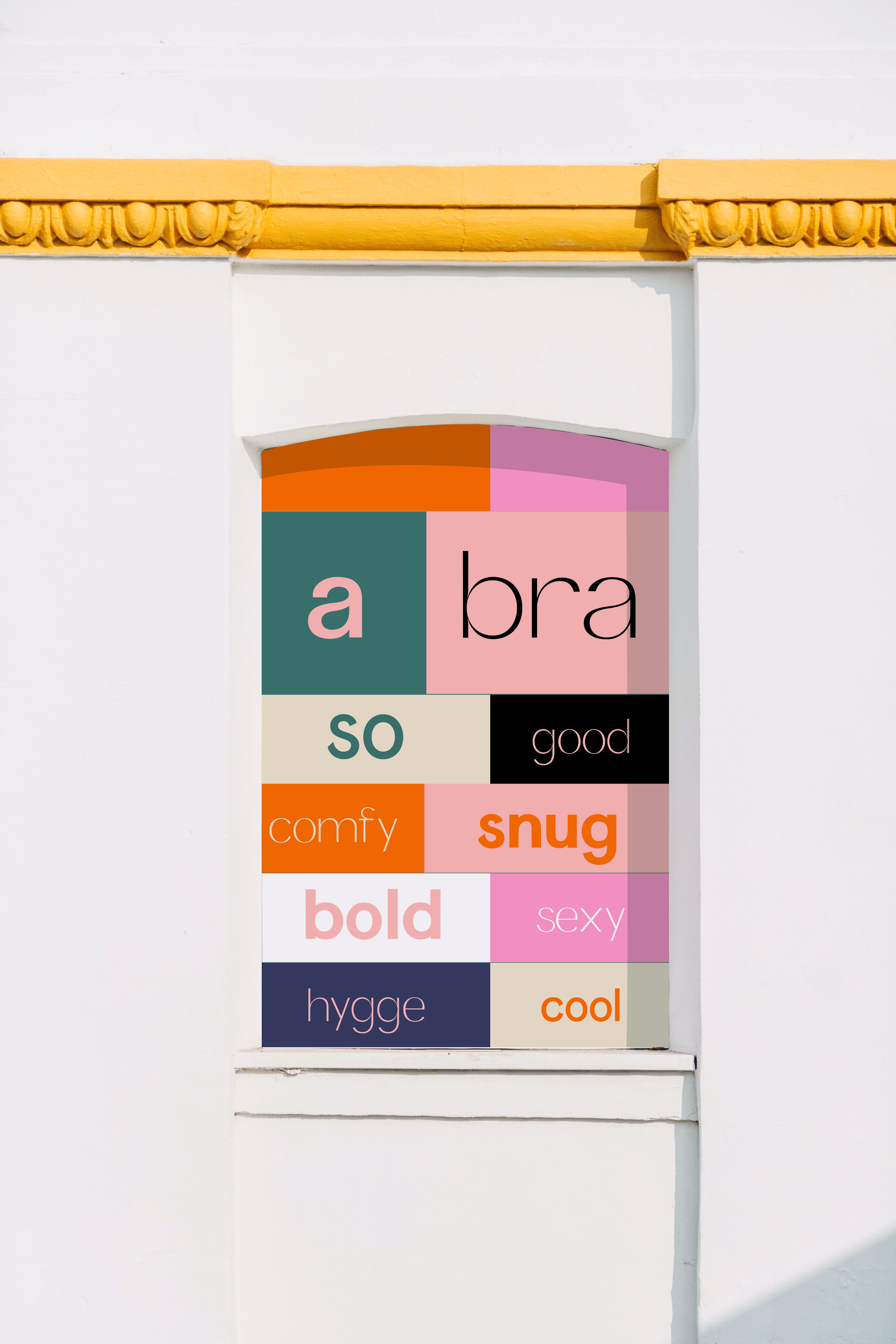
A Bra So… finish my sentence, please.
We built the brand narrative – instead of on hiding and shame – on a positive emotional palette.
Abraso appreciates diversity, sees perfection in imperfections, is humane, relatable and emphatic. Abandoning the healthcare category – the bras become a real-life-fashion-item to be proud of. As we all should.
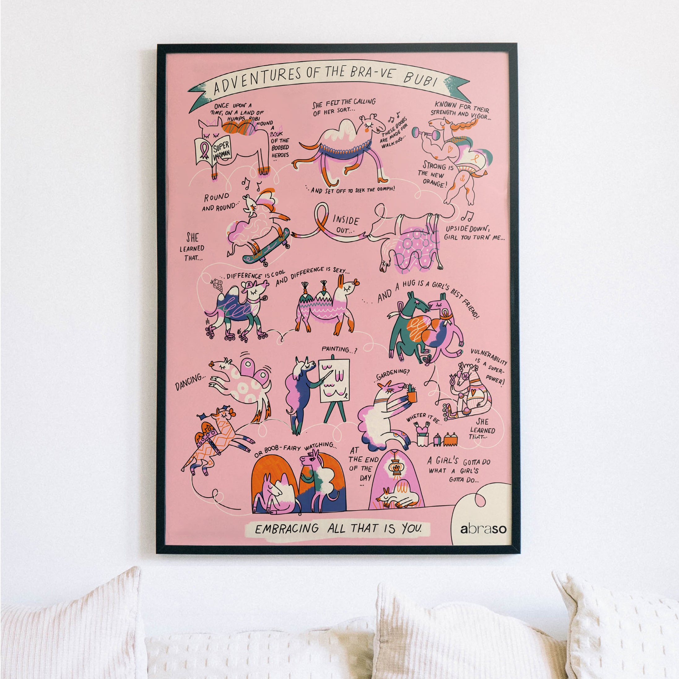
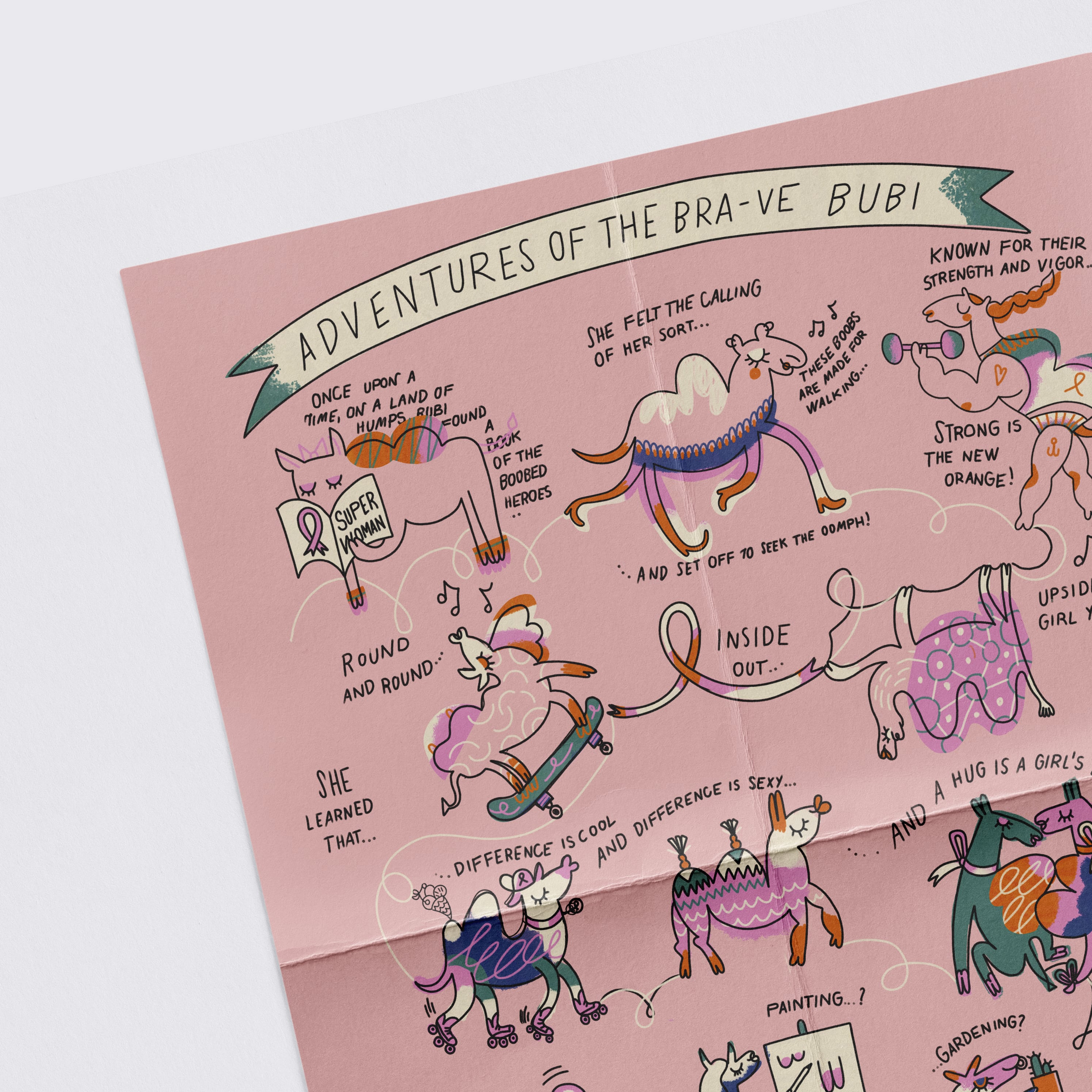
EMBRACING ALL THAT IS YOU – became Abraso’s motto.
the brand
Saying yes to life – translated to shapes, colours and typography.
It was a low hanging fruit to have a dynamic logo concept – so we grabbed it. What else would be more inclusive than a logo that looks good in many forms and variations – while maintaining coherence. It would be playful, elegant, alive.
The colors: First we decided on an overall palette description: vibrant.
Picked pink for femininity. Even girliness.
Orange for warmth of a hug.
Green for grounding.
Dark blue – nightly mighty.
The font: Developled by a fierce and independent font foundry – versatile, many weighted, subtle when need be and bold in some cases. Craftful and empowered. Kyiv, it’s called.
the mascot
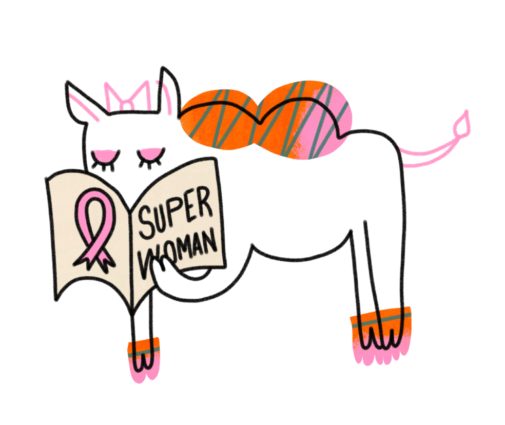
The story of the brand was not easy to tell. Emotionally loaded, avoiding being triggering or explicit. Illustrations helped us pave a way to a gentle narrative of a loaded topic. A brand character was called to life – the oddly humped camel, Bubi.
Through her we could tell stories, give instructions – create education that is relatable and tactful.
Each of the brand’s touchpoints should be an experience. Unboxing, revealing the product is always a special one. Abraso bra’s come wrapped in a poster – a story of Bubi – meeting adversity, celebrating diversity.


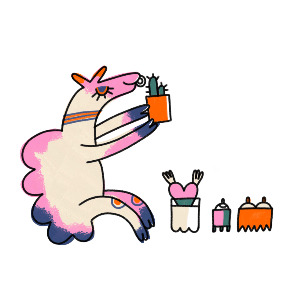

Bubi’s adventures, the motto, the tone of voice developed into quite an attitude. It worked wonders on social media – continuing to empower women with special stories ever since.
Carmel took over the brand maintenance – with a brand kit that would even have served her on a desert island.