Translating biomimetic fiber science into a recognisable brand system
AJA Labs develops plant-based biomimetic fibers designed to improve how synthetic hair extensions and technical textiles interact with both the body and the environment. Their work sits between laboratory research, material innovation, and future-facing product applications, inhabiting a space that requires both scientific credibility and a sense of material sensitivity.
When we started working together, the brand didn’t yet reflect that balance. The identity felt visually loud, and didn’t communicate the finesse in the research and the materials. At the same time, the company needed to speak clearly to investors and production partners while preparing for a consumer-facing future.
I developed a new identity and website that translates fiber science into a recognisable visual presence — one that feels precise enough for research contexts and fluid enough to stay connected to hair, movement, and botanical origin.
Rebrand, Creative Direction,
Logo, Color palette, Typography
Website

Where material science meets care
Early conversations around the brand made one thing very clear: AJA Labs wasn’t just developing another synthetic material. Their work sits closer to the body. It interacts with hair, scalp, and textiles that people live with every day.
The challenge was to position the company somewhere between laboratory precision and material intimacy, without drifting too far toward either technical abstraction or lifestyle branding.
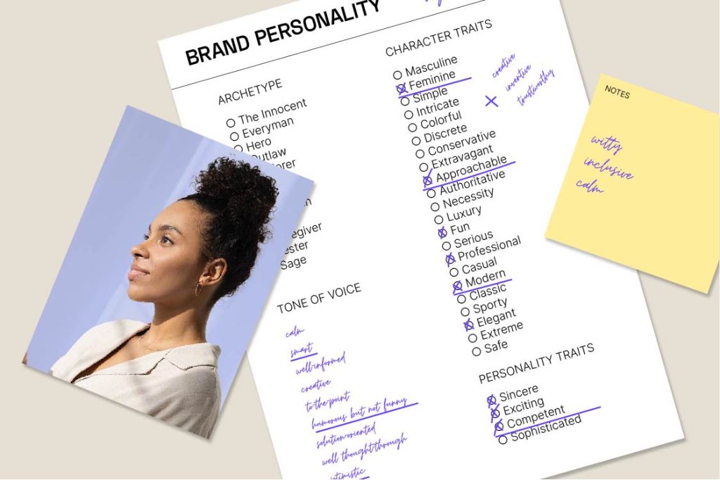
We defined the brand personality around that tension:
– scientific but not clinical
– soft but not cosmetic
– innovative but grounded in plant knowledge
– future-facing but physically real
This direction shaped every design decision that followed, from the logo structure to typography and colour.
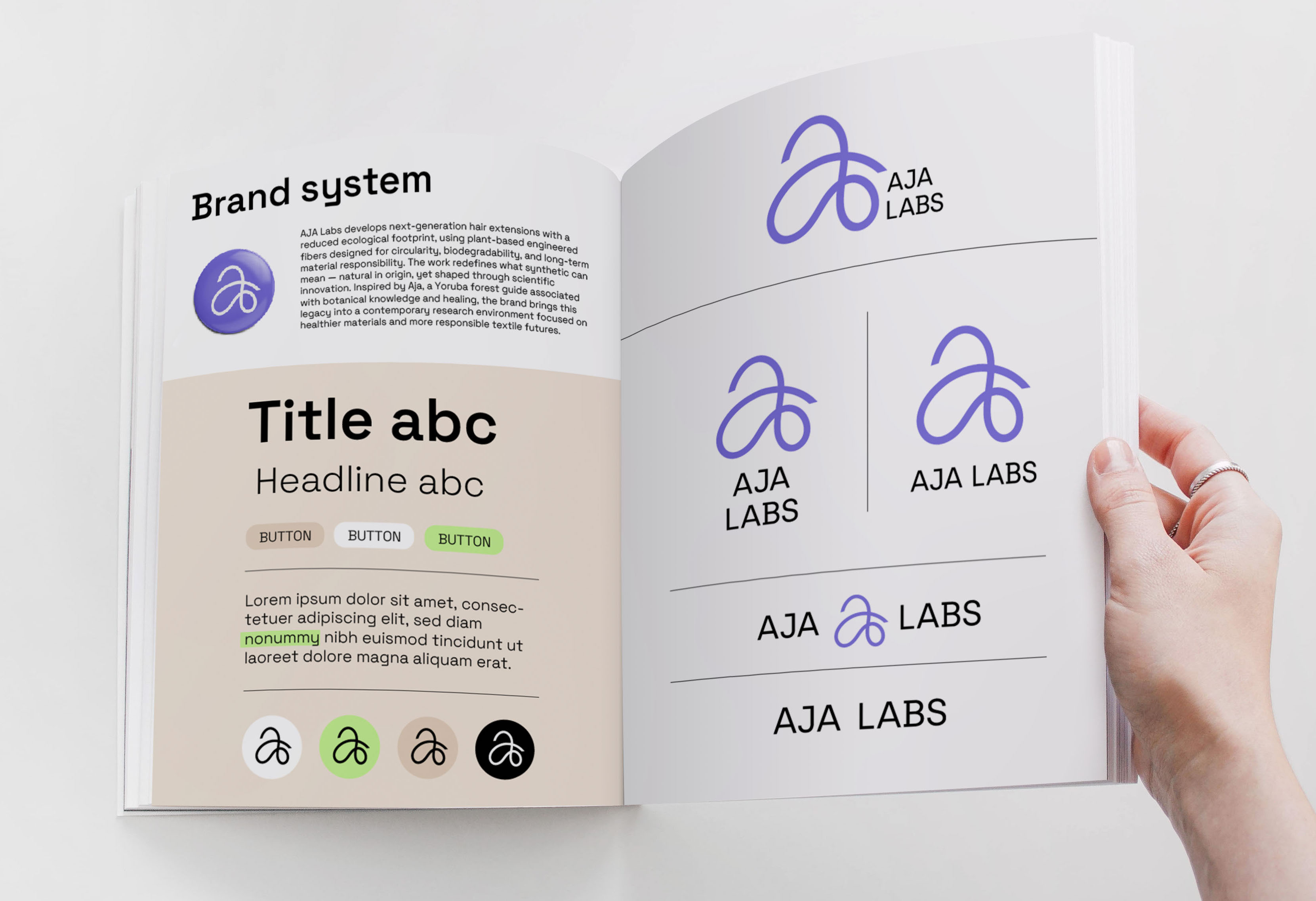
Moving away from a static symbol toward a material gesture
The previous logo and identity felt rigid and generic. Its colour and shape language didn’t reflect the flexibility of fiber as a material or the botanical intelligence embedded in the company’s name. It also leaned too heavily toward a loud synthetic aesthetic rather than the quiet precision of biomimetic research.
Instead of designing a symbol about fiber, I built the new logo directly from it.
The letterform grows from a single strand that curls into a flowing “a”, allowing the mark to behave like the material it represents — flexible, continuous, and directional. That movement introduces a feminine softness without losing technical clarity, which was important for a company working so closely with hair and scalp environments.
The name Aja itself carries another layer of meaning. In Yoruba cosmology, Aja is associated with forests, animals, and herbal knowledge — a guide connected to plant-based healing. Rather than illustrating this reference directly, I translated it through motion, flow, and botanical intelligence embedded in the structure of the mark itself.
The result is a logo that connects fiber engineering, plant origin, and embodied material experience in one gesture.
Pairing movement with precision
The colors
I paired the mark with a more technical typeface, reflecting the scientific depth behind the research. The font choice ensures strong legibility across investor documents, research material, and production communication.
This contrast was intentional, letting the logo mark carry movement and symbolism, while establishing authority and structure with the typography.
Together, they position AJA Labs exactly where the company operates: between laboratory clarity and material transformation.
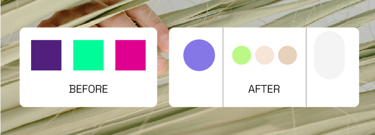
We reworked the palette to introduce softer tonal relationships that feel closer to fiber, hair, and plant-based sourcing while still supporting technical communication.
The result is a colour system that moves comfortably between research presentations, manufacturing conversations, and future product-facing environments without losing coherence or confidence. This approach was quite a departure from the previously too vibrant palette.
Making fiber research easier to navigate
The website needed to explain a material that most visitors had never encountered before.
Rather than presenting the research as a dense technical story, I structured the site to guide visitors through how biomimetic fibers relate to hair, plant sourcing, and future material applications. The goal was to support investor understanding and production conversations while keeping the brand open for future product storytelling.
Visually, the site continues the logic of the identity system: flowing forms paired with structured typography, creating a digital environment that feels credible in research contexts but still connected to the material’s lived application.
