fertility detangled
There is nothing modern about modern fertility.
The founders of Celery Health were about to change that.
They came to me with a sensitive, confusing topic – hoping for – and getting- a crystal clear, intentional and friendly brand.
https://celeryhealth.com.au/
Branding
Illustrations
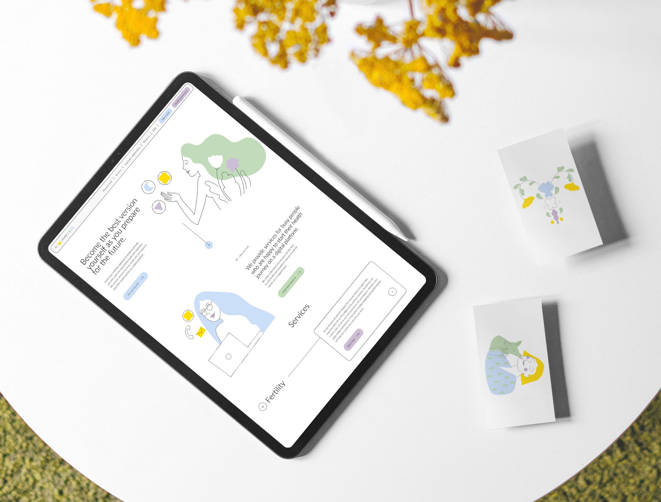
Web Design
Fertility is considered a medical topic. With real life doctors, appointments months away, tests that nobody understands, instructions given in latin and decisions made above the patients heads. The information out there is by now plenty, but not backed. Questions get simplified answers. Correlations, ain’t nobody got time for that.
Celery Health set out to provide clear, expert-vetted information about fertility related topics, accessible tests, a flawless roadmap – all tailored to their clientele. Their vision is to be approachable yet professional source and service provider. Surprisingly, as one of the first ones on the market, and unmatched in Australia.
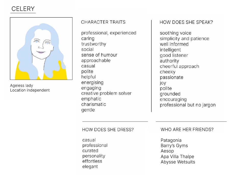
Branding on my table always starts with a long conversation. Some agencies call it a strategy workshop – I prefer to have an interview style brainstorming session. This allowed Celery’s founders to talk openly about their motivation, vision, their clientele, their likes and dislikes, and their mission how to change the world of fertility with their business.
the people
the brand
People interested in Celery Health’s services are considered patients a way before they even have a problem.
They may be patologised while they just seek information, clarity, and want to know all their options to plan their lives accordingly.
They may live in remote areas or have an extremely tight schedule – making frequent doctor’s visits difficult.
Mapping out their difficulties helped us hone into ways of providing the best services for them – and informed every step of the branding.
The tone of voice for the brand is friendly and reassuring – with the desired clarity and professionalism.
The visuals aimed to place them in a clean yet not too medical space – working with shapes, colors and typography that is trustworthy and hopeful – as opposed to pathologizing and sterile.
We struck a fine balance chosing the visual treatment of this brand. We decided to create an almost transparent, airy, kind but professional atmosphere – that would fit the messaging and serve on different mediums.
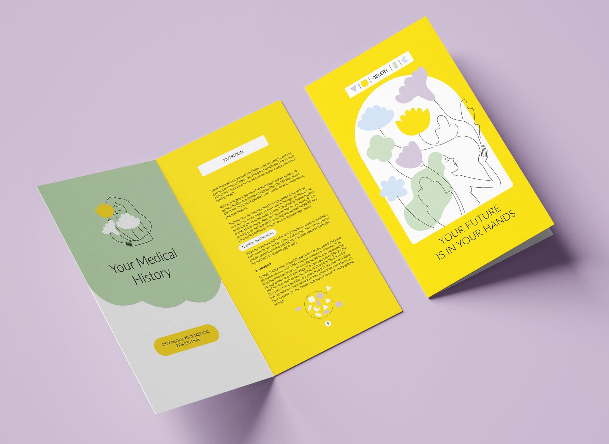
Think petri dishes, observing cells under a microscope and marry them with fruits and flowers. We broke down the holistic approach of the brand to main chapters and assigned them to suggestive, yet minimalistic symbols. Bringing them back together – hinting that fertility is never just a one-sided topic.
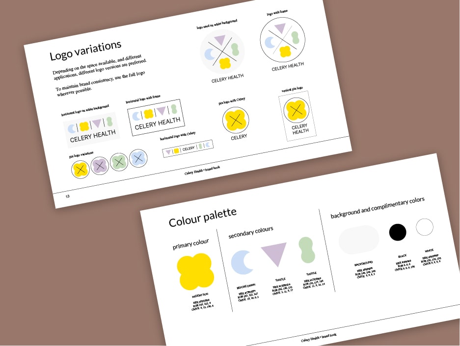
The colors: The crisp lines wished for a softer palette to keep the balance.
The keyword was holistic – we pulled a color from the whole spectrum. And combined them to make a harmonious whole. Looking and the colors individually may seem childish – however hinting at baby rooms and toys wasn’t too far from the tree in this brand’s case.
Typography: Remember the last time your doctor prescribed you something? The undecipherable handwriting is a good metaphor for what Celery’s clients have been going through. We cleaned it up. Made it very legible. Fine. Sophisticated. So that any kind of worry or misinformation can be lifted from their chest.

The illustrations
There is a lot of text when you are explaining fertility-related topics. On the other side of the screen, your reader may be anxious, curious or overwhelmed.
The illustrations we developed for the brand act two ways. On one hand, they support the information shared. On the other hand they evoke hope and make the facts at hand more relatable.
Borrowing from the fine lines and shapes of the logo, we developed an illustrative system echoing every element of the brand.


Celery Health and I struck a deal. As the brand grows and develops, I’m right by their side to ensure that every touchpoint carries the brand experience.
