cascara cabinet enters the market
When you tell me not to think of coffee, I will. (I will think of coffee about 50 times a day.) Creating a brand that uses the ingredients of coffee, but doesn’t want to mention it? Challenge accepted.
Cascara Cabinet came up with a soda never marketed before.
The brand had to be as trailblazer as the drink is.
https://cascara-cabinet.com/
Branding
Illustrations
Package
Social Media
Web Design

Vincent (CEO) came to me with a mission impossible. Developing a product that had a lot of health benefits – that were hard to explain.
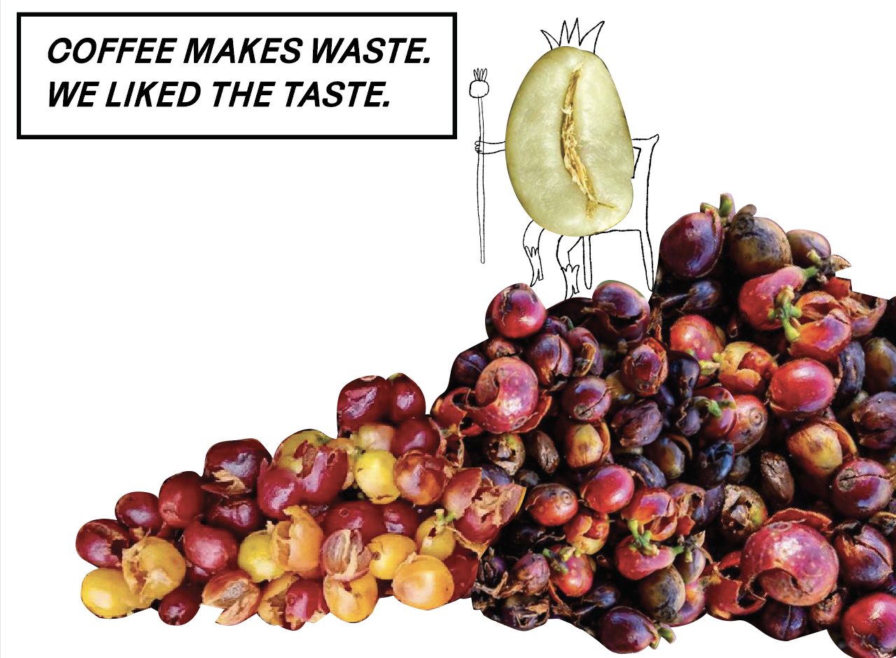
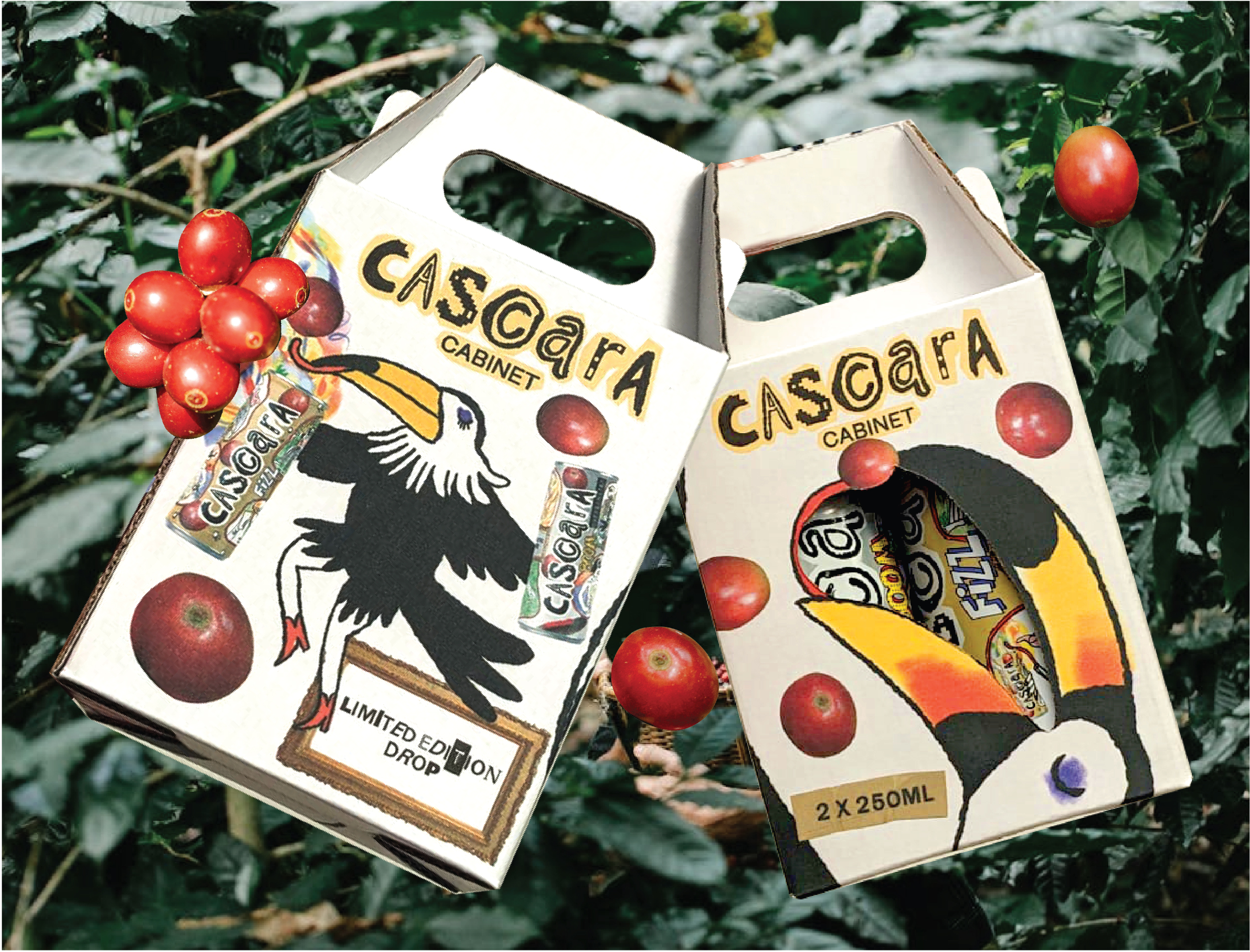
As it appears, coffee cherries are dried and discarded.
And so are agave and carrots.
If you throw them together – instead of throwing them out – and add some bubbles, you get a delicious drink packing 4.2 grams of fiber. Plus, you help underpaid coffee farmers make a buck from their “trash”.
It sounded too good to be true. Too good to be unknown.
We took the leap and settled with a name. Cascara was a low-hanging fruit – however we could not trademark it and needed to be more specific. Cascara Soda would have tied our hands – in case the brand was to expand and use the ingredients in other ways.
Cascara Cabinet was born – thinking of Cabinet of curiosities – keeping our options open – evoking curiosity and inviting the people who were willing to think out of the cabinet.
the people
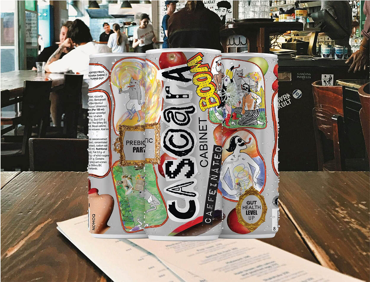
the package
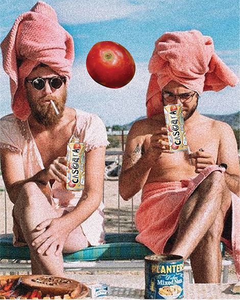
It’s good, but who would drink it? Sure, everyone would try it once, but we needed to get specific. Meeting exotic ingredients, not tasting like anything you knew before – we needed to find the explorers in spirit. Professionals, dreaming about surfing at their desk. The Curious. People who tried kombucha and drank it again. Folks at cafés quite tired of getting their caffeine from coffee. Runners. Chess players looking for a focus boost. Flat white drinkers – our profile went.
As we developed these groups, searched their habitats and stumbled upon some unexpected dwellings – offices. Down the line, Cascara Cabinet started supplying tech-giants desk-bound but invention-spirited workers.
Cascara Cabinet did not need to be anything because it had no predecessors. At one hand, we had a carte blanche – at the other, we needed to find just the right spot to entice and make The People curious before they would open a can.
What they would taste would be unexpected – and that needed to scream from the can. What it’s made of, would puzzle them – easter eggs and playfulness being the second ingredients.
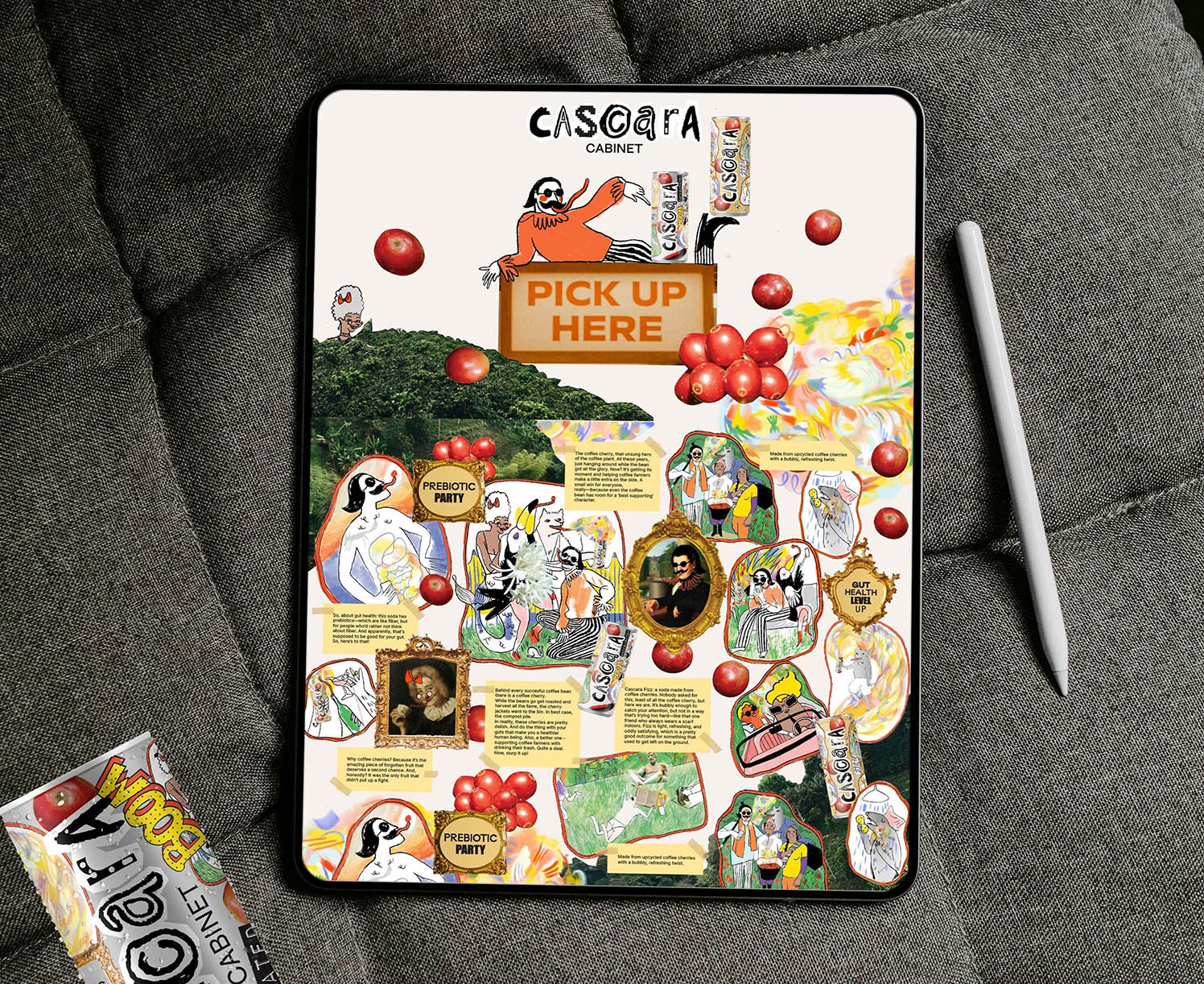
Our people may not be into art but they would understand a comic. They would be affected by the delightful mess of a well-constructed collage. They would recognise hand-drawn scenes and feel – or want to feel what they promised.
A handful of relatable scenarios came into mind – recalling the spicy mundanities and highlights Our People either did participate in, or wanted to.
We made it human, relatable – calling illustration to the rescue.
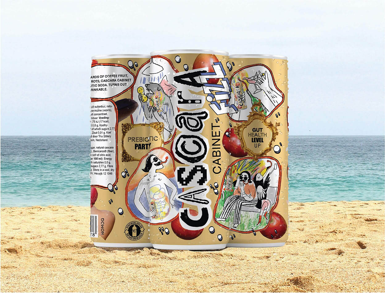
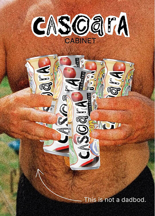
We developed a handful of characters – frolicking through the package and POS materials. They are cartoonised version of the brand’s customers – raw, real, honest, and fun.
We literally “cooked” with a bunch of unrelated ingredients – making a collage inevitable. Floating elements – showing a cheekily unknown, apple like coffee cherry, toucan feathers – referring to the origin of the cherries and calling one of the characters in spotlight, tongues – clearly nudging towards a pleasant ambush on one’s taste-buds. All brought together in a beautiful mess our drinkers would recognise as their lives.
Bottom line: we put a cultural portrait of them on our cans. One they would relate to and remember.
And built a library of elements – dynamically spread through package, POS, social media, festival stands, and merch.
Having done research in the soda-shelves, it started to look nothing alike kombucha or craft beers. We long ago stopped talking about coffee altogether.
The two variants – Fizz and Boom would speak for themselves. Fizz promised bubbles and there was no good word to describe how it tastes – other than Fizz.
Boom gives you caffeine, ending up in a pop-art idea bulb blinking over your head.
The stories displayed on Boom and Fizz would be different – Fizz showing more peaceful situations while Boom displaying high energy life and cheering.
Emotions connected to moments you would drink these beverages in.
the brand
We knew from the get-go that this brand would live first and foremost through the package. The cans would be the items our customers see, grab, and return to. Instead of the traditional process of developing a good looking brand book first, we maximised the emotional effect of the package itself. Everything else would be a translation of what happens in the cans.
The website is an interactive version of the cans. The fair stands are a spatial translation of the cans. The smartly chosen collage aesthetic gave us a lot of leeway to organise everything fitting the medium at hand.
The colors: borrowed from the ingredients and origin – evoking vibrance and surprise.
The typography: Carefully chosen mix of fonts, with clearly set rules how and where to combine.
Handmade logo: Recalling the manual involvement of the concoction process, tightly designed – but not taking itself too seriously (our People would not either.)

the rest
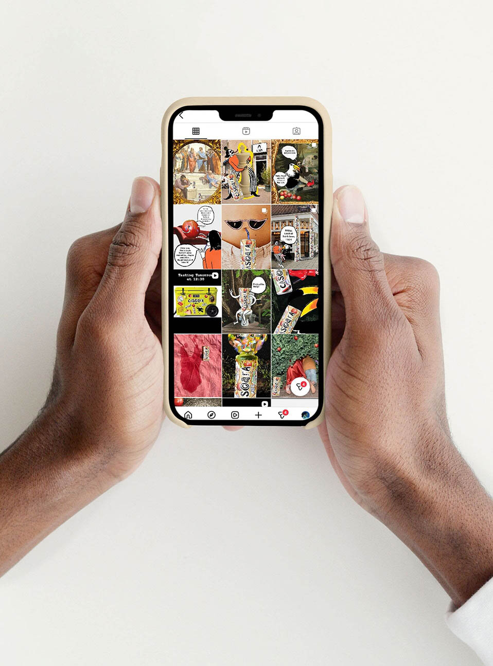
We did not go lightly over social media. Yes, we could have picked the well-throdden path. Posting reels with cute people enjoying their drink, trendy tunes, hopping on the dopamine train. Instead, we took a strategy that may burn slower – but is truer to the brand. Cascara Cabinet’s number one value being surprise and curiosity – every.single.post has been carefully constructed accordingly. Starting off it became more important that our instagram page tells our story truthfully – and sets a witty tone, playfully revealing the miriads of health and life quality benefits the drink has.
Copy played a big role in this. Instead of posting mindlessly, we spent time on each post – hitting the right tone. This gave us opportunity to test things out small first, pivot and eventually scale.
Jokes on us!
As the brand continues to grow we keep crafting it as a full experience, on application at a time. We aim to stay off-the-beaten path, being a Challenger Brand.
It’s not easy. It takes much more involvement than coloring between the lines. But we are, above all – authentic. And our people dig that.